CASE STUDY
Revive | Physical Therapy Mobile App

Requirements
A validated design concept for a patient-facing, native health and wellness app. Based on user research and competitive analysis, the mobile-first app offers users high-priority content, intuitive interactions, and branding that encourages retention.
Industry
Healthcare
Organization
Created for CareerFoundry’s UX Design certification program
My Roles
UX Researcher, UX Designer, UI Designer
Tools
Figma, Zeplin, Google Forms, Balsamiq, OptimalSort, UsabilityHub
Defining the Problem
Proposition.
I started with a design problem and a hypothesis:
Healing through physical therapy can be a long, boring, painful process.
Patients need organizational tools and positive motivation to effectively improve their strength and mobility.
Photo by Ryan Snaadt on Unsplash
Research.
Competitor analysis of physical therapy apps Curovate and RecovAware indicated key opportunities:
Address PT scenarios beyond ACL injuries and joint replacement rehabilitation
Prioritize a friendly tone and clear design in addition to providing rigorous medical care
In 35 surveys and 4 remote interviews, I asked users with physical therapy experience these questions:
What physical needs do users have during physical therapy?
What is their biggest challenge on a daily basis?
How do users think and feel during healing periods?
What experiences have users had with tools that manage tasks?
For how long does this app need to keep users motivated and active?
Analysis.
-

Research Findings
Affinity mapping and trend analysis revealed users’ priorities and needs. Users highlighted the importance of tracking their progress and communicating easily with the physical therapy clinic.
Assumption alert! Users emphasized the emotional challenges of recovery. I pictured a motivational feature based on personalized goals and positive memories that I thought would help. -

Faces and Cases
Surveys and interviews combined to provide a composite view of the patients and physical therapists who could benefit from a physical therapy app. Three user personas captured important trends, like users’ desire to act independently and the need for hope during discouraging recoveries.
Building the Prototype
Blueprints.
-

User Stories and Flows
Using interview findings, I plotted out the journey map of a user persona trying to access physical therapy and do his exercises regularly without the benefit of an app.
The persona’s low points indicated which activities users need help with the most, such as doing exercises correctly at home. I mapped these activities in user flows to capture each step the user would need to find in an app. -

Card Sort and Site Map
Combining the user flows produced a draft site map containing the features research had identified as essential: tracking recovery, scheduling appointments, messaging the clinic, doing exercises, and checking progress.
Turning point! A card sort suggested that patients want to see their recovery as one story from start to finish. As a result, I combined functions from storing a diagnosis to tracking progress all in a single branch. -

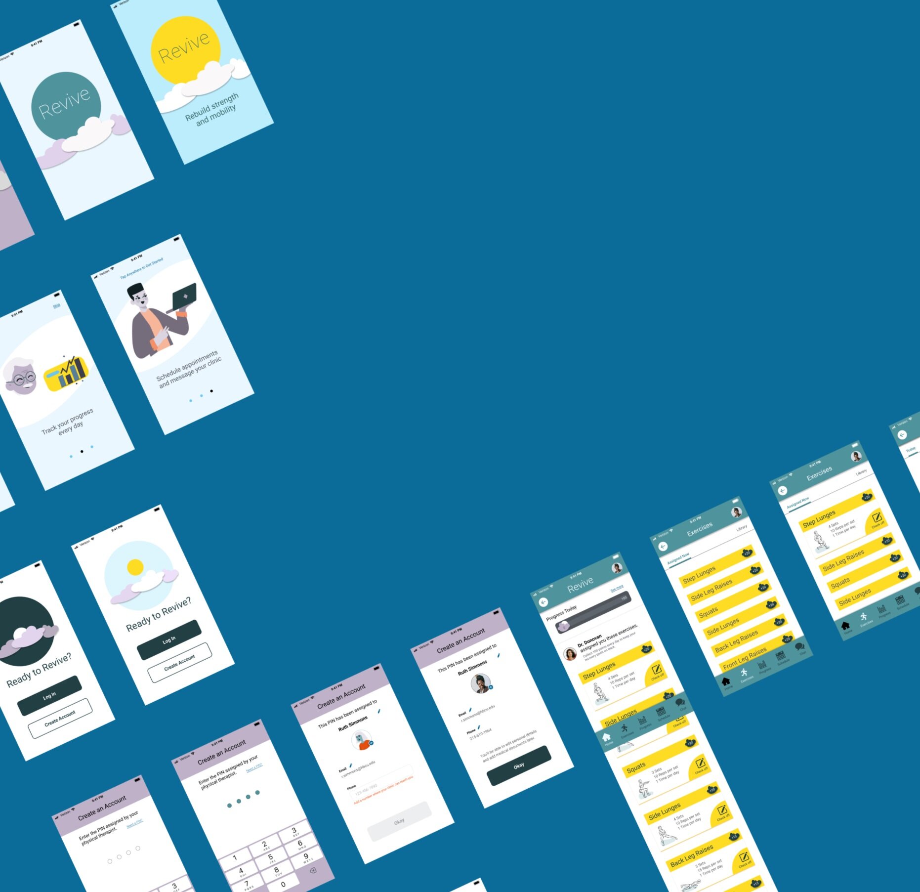
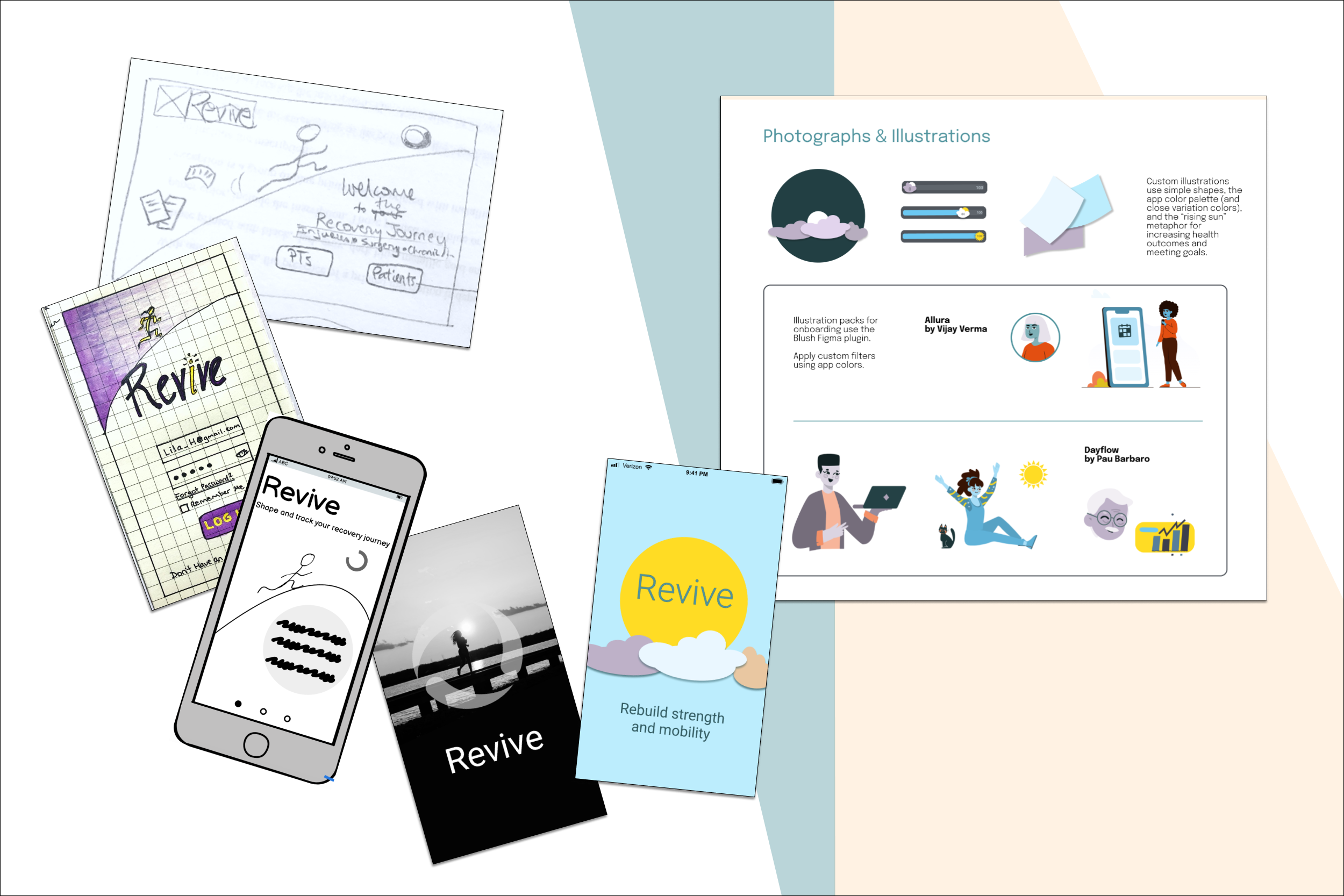
Sketches and Lo-fi Wireframes
Starting with sketches on paper, I blocked out the features and navigation from the site map. Adjusting the spacing and simplifying screens at each step, I translated the sketches into low- and then mid-fidelity wireframes.
At this point, the running person icon led to all “recovery story” functions, and scheduling appointments was hidden under a “my clinic” icon. An array of progress trackers took up the top of the home screen.
Activation.
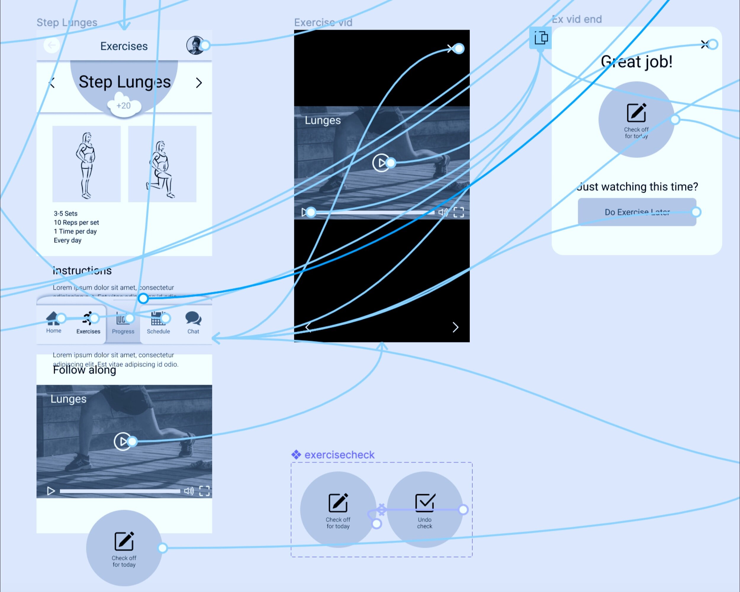
Referring to my user flows, I set up interactions between the wireframes to enable a clickable prototype.
Now I was ready to test the app’s hypothetical features and organization.
Testing and Refining
Usability.

Gathering Data
Live, remote testing with six people revealed a number of areas for improvement. Test planning and analysis tools smoothed the process.
Turning Point! Users drew my attention to several confusing screens and hidden functions that could have been easier to find, such as scheduling an appointment and checking progress in one’s exercises.
They were not interested in setting extra personal goals, and indicated that they’d rather collect pre-defined points or rewards.

Insights and Adjustments
Several important changes resulted from usability testing analysis:
Dividing the “recovery story” into activities—clearly labeled icons in the main navigation bar—and static documents, which moved into a drawer menu accessible from the profile icon.
Scrapping the “set a goal” feature that asked users to input reflections and build their own reward badges, and replacing it with a points-based progress tracker that keeps users focused on exercises. Assumption resolved—at least until future research on this feature.
Rethinking emotional motivation, and fleshing out an encouraging tone and illustrations to take on that function.
Access and Polish.
Look and Feel
From early sketches to high-fidelity wireframes, I gradually refined Revive’s images, colors, and mood. The figure running uphill toward the sun became a simpler illustration—the rising sun—that now appears in onboarding, login, and progress tracker animations. It suggests light, healing, natural cycles, and change over time.
With a style guide and design language system, I standardized visual and interactive components and documented them for team members.

Accessibility and Universal Design
I applied uniform styles to all wireframes and checked interactions and whitespace to make sure navigation steps are intuitive, reversible, and clearly labeled.
Turning point! This final renovation adjusted Revive’s UI to WCAG-approved color combinations and added text-to-voice and audio description. To make the app friendly to screen readers, I tidied up formatting and the order elements appear in before exporting the project assets.
Take a look!
Check out this video walk-through of Revive’s clickable prototype for mobile.
What’s next?
Revive has potential for many additional design cycles. These could:
Build out the desktop interface for patients
Design the portal that enables clinics to manage patients and appointments and assign exercises
Research how physical therapists track outcome measures and expand the progress tracking feature to include additional data and displays